Migrating from Raised Button & Flat Button to Elevated Button and Text Button Widget

Hello there, we’ve all seen recent updates in the flutter ecosystem from the majorly of which were unveiled during flutter 2.0 launch, which also brought about some changes alongside in Widgets…as we all know “Everything is a Widget” 😉
This article will serve as a brief guide on how to transition quickly from using some deprecated Widgets like Raised Button and Flat Button to its corresponding revamped Widgets Elevated Button and Text Button. It will also cover some fundamental changes that are of essential while using these new widgets and also address some of the code changes while implementing it.
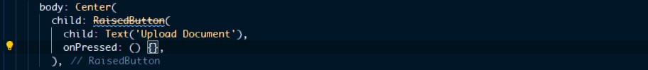
Raised Button => “Elevated Button” :
The Raised Button is mostly used for getting a pleasant clickable gesture but this widget has been deprecated and has been replaced by the Elevated Button .
The elevated button also has its variant which is the "ElevatedButton.icon", which allows you to add and icon and a label property...
The elevated button however comes with some new way of styling than by using the either the Elevated.styleFrom property or ButtonStyle property.... with the .styleFrom being the most convenient
   Center(
         child: ElevatedButton(
          child: Text("Upload Docs"),
            onPressed: () {},
            style: ElevatedButton.styleFrom(
            primary: Color(0XFF3424),
            textStyle: TextStyle(fontSize: 12),
            ),
        ),
   ),
          ElevatedButton.icon(
            onPressed: () {},
            label: Text('Proceed'),
            icon: Icon(Icons.forward),
          )
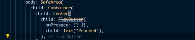
Flat Button => “ Text Button ” :
This is the simplest form used in creating a button also widely used as a form of interaction between the user and the app interface. This widget has been deprecated and replaced by Text Button Widget Text Button ,It also has the same styling pattern as as the previous but uses either TextButton.styleFrom or ButtonStyle property.
       Center(
           child: TextButton(
              child: Text("Proceed"),
               onPressed: () {},
               style: TextButton.styleFrom(
                padding: EdgeInsets.all(20.0), //Inreases the tap radius of the button
               ),
            ),
       ),
Thanks
That's a wrap for now ....hope this would serve as a quick resource to help remember how to apply new changes made in these widgets, Thanks for reading


